

2nd place SBCL Designation 2023
OVERVIEW
We were allotted 72 hours to analyze a chosen app used for making connections for potential improvements and to develop a new feature. Our team of 3 chose Hinge, proposing a compatibility percentage feature derived from daily values-based questions presented to users upon opening the app.
This feature includes a dedicated section on each user’s profile, highlighting their response to one daily question and indicating the similarity in answers with the viewer.
“Think of it as like hitting a slot machine”

BRAINSTORMING
Despite its popularity, Hinge struggles with deeply understanding and continuously engaging users, resulting in superficial matches and inconsistent long-term connection success. Many also experience “dating app burnout” or “online dating fatigue”. There is a need to enhance the initial user data collection process and introduce ongoing interactive features that refine user compatibility.
In our redesign of Hinge, we aimed to create a more engaging and meaningful initial experience for users upon opening the app. The process begins with a set of comprehensive introductory questions, designed to gather insights into users’ values, preferences, and lifestyle choices. This data forms the basis for the compatibility score.
This score, reflecting potential match quality, is calculated from how well users' answers align and is expressed as a percentage. It's dynamic, adjusting as new information is added each day.
We also added a daily question feature, prompting users every time they log in. These questions are crafted to elicit deeper insights into users' current thoughts and preferences, continually refining the compatibility score as users evolve.
WIREFRAMING
During the wireframing stage of the Hinge app redesign, the team transitioned from initial sketches to digital wireframes in Figma, enhancing detail and clarity for iterative testing.
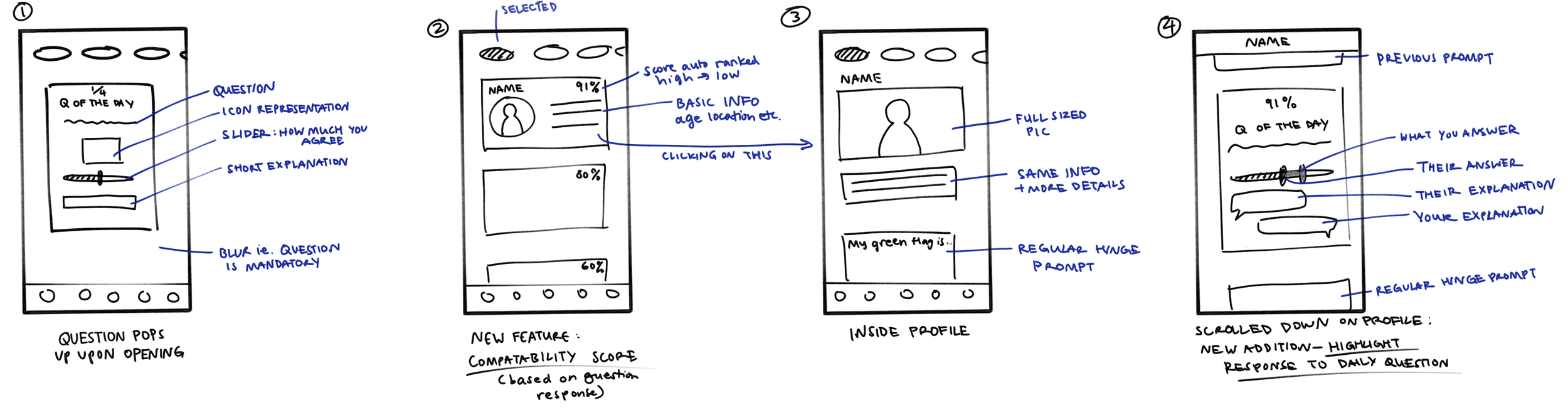
The first wireframe introduces the "Questions of the Day" with a slider for users to indicate how strongly they agree or disagree with the above statement. There is also a comment box to explain their answer.
The second wireframe displays potential matches sorted by compatibility scores, with the highest appearing first. This information card shows the percentage score, their picture, and other basic information.
The third wireframe focuses on what the full user profile would look like after clicking on the information card.
The fourth wireframe allows users to highlight one of their daily question responses on their profiles. It shows what the other party responded alongside your response, as well as the comments from both sides. This comparison is only accessible from the perspective of the user viewing the profile.


THE PROTOTYPE
The final prototype of the redesigned Hinge app features a minimalist color palette with vibrant accents, maintaining focus on interactive elements like the slider for daily questions.
Profiles are streamlined, showcasing essential information at a glance alongside the compatibility percentage.
The key benefits of this redesigned approach include:
• Daily questions encourage regular app usage, keeping the user base active and continuously updating match relevancy.
• A compatibility percentage based on detailed profiling can attract new users looking for a novel and value-based dating approach.
• Compatibility scores encourage authenticity, as responses to questions are anonymous except for one featured response of the user’s choice from the daily questions. Being truthful only helps in matching with someone of similar values.


Securing second place in the competition was a fantastic achievement for our team, especially as this was our first attempt at app design. The experience deepened our understanding of user-centered design principles.
I’m excited to use what I’ve learned in this project for future challenges and design even better digital experiences.